
Hi everyone, Ashley here! After making countless Sailor Ink Studio ink samples, I began to notice a pattern in the numbers that Sailor used to name their inks. With a bit of research I learned about this intricate and well-organized system, and hope that I can shed a bit of light on what may seem like a daunting amount of numbers.
Sailor first released the set of Ink Studio's 100 inks in 2018. The developer decided on naming each ink with numbers to prevent the ink user from being biased by more descriptive names. The numbers are meant to give freedom and allow each person to use the inks however they want. Though Sailor has not come out with an official statement, I've put together a brief guide with the help of Macchiato Man, Well Appointed Desk, and Hobby Stationery Box's INK Magazine (Ken Takeda and Mashiro Koike)
Each ink has a 3 digit number code.
The first digit (###) represents the brightness and saturation of the ink. The higher the number, the darker and more saturated the ink will be. However, 0 on this scale is like a 10. It is the darkest, resulting in black inks. The darkness can often affect the ink's shading properties, with inks from 600 - 900 more prone to shading.

The second and third digits (###) represent the hue of the ink. The hues gradate from Reds to Blues to Violets to Greens to Yellows, then Oranges.
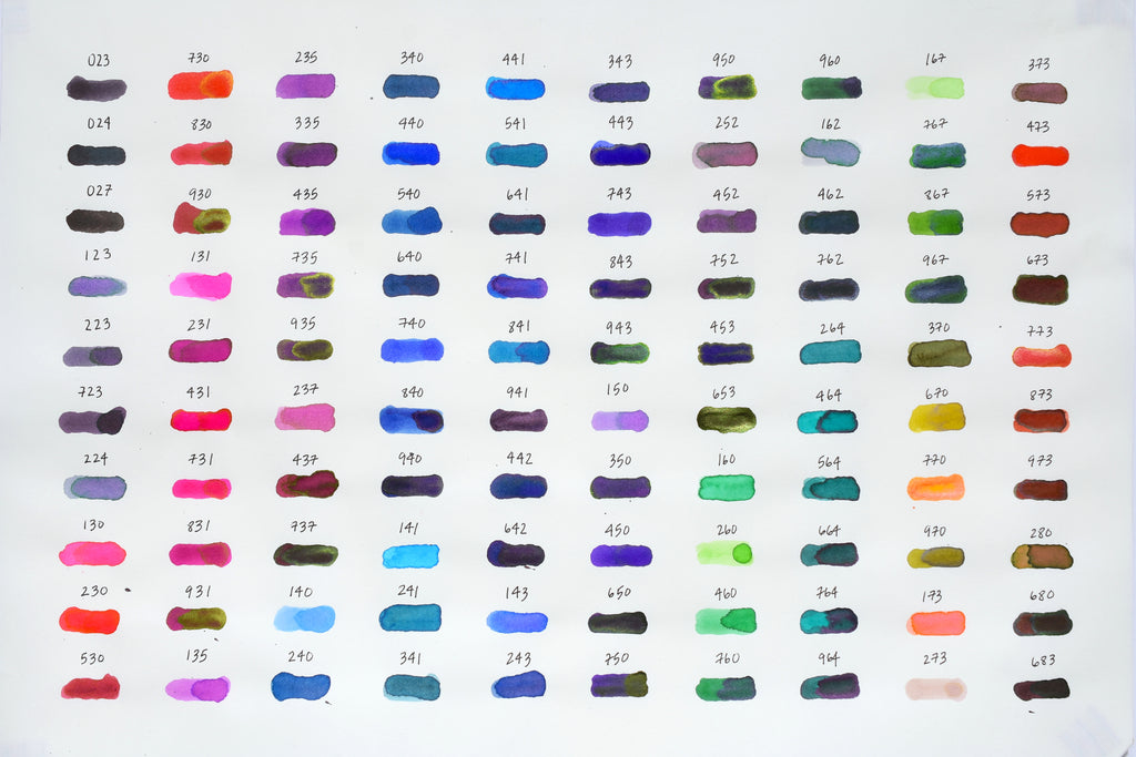
For example, let's look at the 3 inks 140, 440, and 940. All three inks end in #40. This means they will all be the same hue. The first number indicates that they will vary from light to dark, with 140 being the lightest and 940 being the darkest.

Now let's look at 140 compared to 150. Both inks begin with 1##. So their lightness is the same, but their hues are different. We can see 140 is a light blue and 150 is a light violet.

We can see that this is reflected in the gradient of blue colors especially.

This system takes a bit of getting used to, but once you understand it, finding your favorite ink and remembering its name becomes a lot easier and more fun! I love combining numbers that do not yet exist and imagining what ink color they might turn out to be.
After creating this full ink guide, I've begun to theorize that the third digit might have a more significant meaning than I've seen floating around on the internet and in other blogs. I believe that the third digit corresponds to a CYMK hue. For example: 3 = Magenta, 4 = Cyan, and 7 = Yellow. This becomes significant when mixing inks. My working theory is that there are base colors like 160 (light green), and when you add yellow (7) to it, it becomes 167 - a light yellow green.
This last bit is the result of my staring at these numbers for many, many hours and are just my theories. What do you think the last digit means? Does it even mean anything? If you ever mention it to me in the store - once we've re-opened - I'm sure I could go on for hours about it! Hope this helps you all to enjoy your Sailor Ink Studio inks, and maybe even help you to find your new favorite ink in the sea of this 100.


7 comments
Can 737 come from adding yellow (7) to 730? I wouldn’t think.
Also, if we take the first digit as meaning “saturation and shade”, are all the darker ones also more saturated? I wouldn’t think; but maybe that first digit is an average of the colour’s shading and saturation (I am think of 240 too dark for a 2 but perhaps the relatively lower saturation offsets that, or 731… which is very far from being dark (but isn’t it quite saturated?).
After a couple (not many, unlike you) hours spent confronting the numbering conundrum I have come to see it as possible that they playfully mixed up things a bit by adding some randomization to the mix.
A table runner transcends mere functionality, evolving into a style statement for dining spaces. Beyond safeguarding surfaces, it’s a design catalyst, introducing a spectrum of textures and patterns. This versatile accessory seamlessly blends practicality with aesthetics, turning every meal into a visually enchanting experience. https://www.etsy.com/listing/1643059523/macrame-circle-crochet-table-runner
Thank you so much for sharing your insights & these lovely visuals as reference!
Genius! This is immensely helpful with using my Sailor inks. Brilliant! Thank you, Ashley
This is absolutely fascinating Ashley and helps so much. I’ve looked at these overwhelmed and not had an organizing system for viewing them. Thanks! And Mike, could you share your IG since you don’t care to encourage a discussion here where we might all benefit?