
Hi all—Amy here!
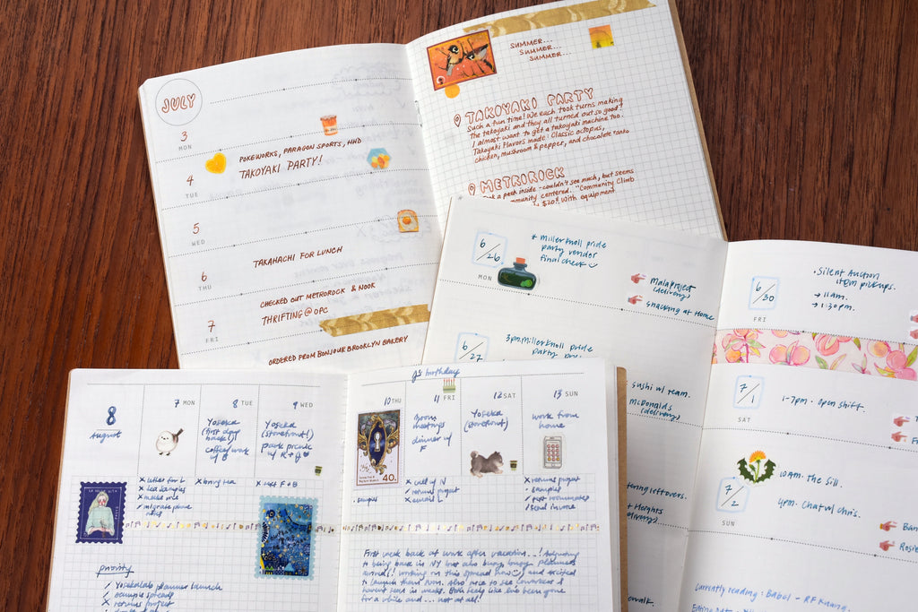
A couple weeks ago the YOSEKALAB Two-Month Weekly Planners that Bethany and I designed finally came in, and we’ve been so excited to finally share them with you all! Some of you have already seen our unboxing video where we talk about our design process and go through the various layouts. Here I’m going to walk through the layouts in a little more detail, showing example spreads made by me, Bethany, and a few of our lovely Yoseka team members (thanks, Ashley, May, and Authan!).
The Basic Specs
If you haven’t seen our planner or the accompanying video yet: YOSEKALAB is a planner sampler featuring a variety of weekly layouts, meant to help users explore different planning styles and discover what works best for them. After researching existing planners, we chose six weekly layouts to showcase, some more familiar and some more unique, to give users a range to experiment with. And we included three monthly spreads—each also with a different format, in the experimental spirit of YOSEKALAB—to make our sampler more functional if users want to engage with it as a self-contained short-term planner. In total, there are enough monthly and weekly pages for two full months of planning, perfect for big projects, recording travels, and more.
This planner contains:
- 3 monthly spreads (3 different formats)
- 10 weekly spreads (6 different formats)
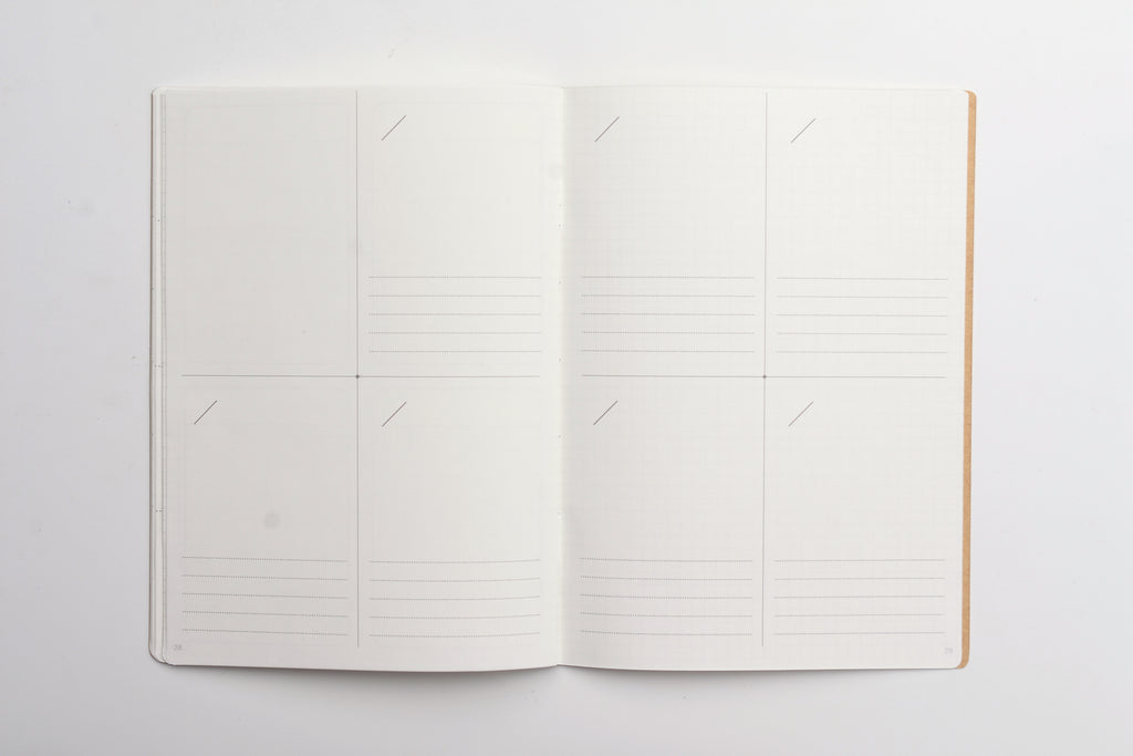
- 4 memo pages (2 in the front, 2 in the back)
- A title page in the front and contact page in the back
Additional features:
- B6 Size
- 32 total pages (numbered)
- 68 gsm Tomoe River paper
- 3.7 mm grid

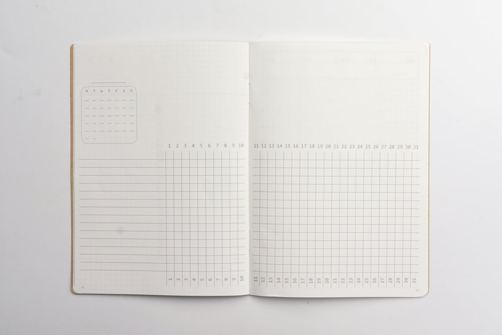
Monthly Spreads
Standard
By far the most popular monthly format, this is a typical undated monthly-block calendar.

Bethany color-codes the events by type in her spread below. She uses the extra margin space to log reading and exercise; this space would also be ideal for listing monthly goals and tasks.

Vertical Gantt
The right page of this spread features a vertical Gantt-style calendar down the center, with space for two different logs or trackers on either side; the left page includes a small traditional calendar and plenty of blank space for memos. This layout references the unique monthly format of Bushimen’s PAL Planner. (The daily pages of the Kokuyo Jibun Techo DAYs also feature a similar central vertical format, numbered as an hourly timeline.)

Here I use the mini calendar view to highlight important dates and the blank memo space for monthly goals and tasks. The vertical calendar on the right tracks habits on one side and logs hours of sleep on the other. Next time I want to try logging two different things in one graph (like hours of sleep and mood) to see how they intersect!

Horizontal Gantt
This spread has a horizontal Gantt chart extending across both pages. One set of date numerals is oriented vertically and the other horizontally, encouraging use for different systems, logs, or trackers. This layout references the Gantt pages in Art Print Japan’s Visualife Monthly Planner (used by Authan), which alternates between standard monthly-block calendars and Gantt pages. Midori’s +Stand Diary and Double Diary Progress also use a similar format.
Authan uses the bottom grid portion to map out projects, listing the tasks involved underneath; the memo space next to the chart points to the month’s main focuses and to-dos. He color-codes the projects so it’s easy to identify each one among overlapping timelines; some are further highlighted with washi tape in the blank space above, which is adorably decorated with stickers and stamps!

Weekly Spreads
Vertical Schedule
This spread is divided into 7 vertical columns, one for each day of the week, and includes a 24-hour timeline to block in schedules. The extra column on the left page and the bottom grid space can be used for memos, to-do lists, and more. The Vertical Schedule format is seen in many popular planners like the Hobonichi Techo Cousin, the Kokuyo Jibun Techo, the MD Gradation Diary, and the Hightide Diary Classic.

Bethany and May both use this layout to block out large chunks of time and list daily tasks in the extra space above or below the main schedule. Bethany uses the grid space below to list weekly tasks and priorities, and a packing list for her trip:

May’s version includes (along with many cute stickers and washi tapes) an ink log and weekly goals in the left-hand column:

Horizontal + Memo
The left page of this spread is divided horizontally into seven long rectangles for daily notes; our version includes three notches that can be used to subdivide this space into smaller sections. The right side features blank grid space for additional planning, notes, journaling, and more. This is another common layout seen in the Hobonichi Weeks, the Traveler’s Weekly + Memo Refill, the Midori Pocket Diary B6, and various planners by Muji, Leuchtturm, and Moleskine.

Ashley uses this layout as a (very aesthetic and color-coordinated!) diary, listing key events on the left side and journaling on the right:

May uses this layout to plan personal and creative projects, with broader weekly tasks on the right page. She uses the left page for daily tasks and sections off a space on the right for events:

Vertical + Memo
This format is a kind of reformulation of Horizontal + Memo; here the top portion of the spread is divided into seven daily blocks, while the bottom features an open grid that can be used flexibly.

I came across this layout while doing chaotic research in January for an eighth planner I didn’t need, and I only ended up finding it in two Japanese planners: the NOLTY 1180 and the Takahashi no. 757. But this year Take a Note has actually come out with a B6 “Medium Weeks” planner that features a variation of this format—so, fans of Vertical + Memo, rejoice! (Note that the Take a Note Medium Weeks B6 divides the page approximately in half, while our version has much more blank space proportionally. I think both versions are interesting!)
Here I use the daily blocks to write in events; I cordon off a small section of the memo space with a slim washi tape to use for tasks, leaving a lot of space on the bottom left for weekly goals and tasks. The right side I use to journal for the week.

Horizontal Quadrant
This spread features seven horizontally oriented rectangles, one for each day of the week, and an extra slot for memos at the bottom of the second page. A fairly common layout, this can found in planners like the Hightide Les Agenda de L’Année, the Traveler’s Passport Weekly Refill, and various planners by Moleskine and Leuchtturm. (It was also the format of the academic planners I was given to use in middle and high school.)

Our version again features notches that can optionally subdivide the days into sections—used by Bethany below to keep a food diary on the right:

Vertical Quadrant (Divided)
Instead of printing the same spread twice as with the others, we decided to instead two slightly different Vertical Quadrant layouts, the first being Vertical Quadrant (Divided). Each portrait-oriented quadrant in this layout includes faint bisecting horizontal and vertical lines; these lines can be ignored or used to divide the quadrant into two (horizontal or vertical) sections, or four even smaller sections. This layout was directly inspired by Bushimen’s PAL Planner, one of the most unique planners we’ve seen.

Ashley uses the PAL as a work planner, so she’s opted to reproduce it below, using the vertical divider as a timeline; she lists broader tasks for the team and her own to-dos on either side. On her off days (Friday and Saturday) she experiments with using each side for different things: Plan/Log and Chores/Social. The empty space in the top left has a weekly breakdown and lists to-dos.

Vertical Quadrant (Memo)
This version of the Vertical Quadrant format divides each daily quadrant in blank space at the top and lined memo space at the bottom. Vertical Quadrant (Memo) references layouts seen in planners like the OURS Research Project Journal and the Takahashi no. 531. It’s a flexible format that can be used for very minimal planning or more creative ventures; the blank space is perfect for drawing, collaging, and more.
Below I use this spread to journal for my last week of vacation this summer, highlighting important moments in the memo portion and decorating with stickers in the space above:

Final Notes
And that’s it for the planner layouts! I know we included a lot of different spreads, some not so straightforward—I hope this helped clarify some things in our sampler or gave you inspiration for planning.
We also include an insert with a short letter from Bethany and me, a more abbreviated usage guide, and a matrix that lists various popular planners according to monthly and weekly formats included, as well as size, to help get people started on their planner search. However, we had a printing error with our planner matrix where the bottom row of our chart got cut off, so the result is offset. To use the matrix, please reference the digital version below or on the product page.

Lastly, this was really a passion project for us, and we’re so grateful for the support that has made it possible—thank you again to everyone who expressed interest in this planner idea (special thanks to our friends, consultants, and cheerleaders Ame and Conor!), and we hope you love playing and experimenting in YOSEKALAB with us!
We’d love to see how you use your spreads and which layouts you’re excited about or enjoyed using (I’m the most curious to try the Horizontal Gantt monthly layout, and I want to play around more with the less common Vertical + Memo and Vertical Quadrant layouts!). Feel free to share with the hashtag #YOSEKALAB — and happy planning!
—Amy


